Contact person
Tijl Hoornstra
Digital Strategy & Strategic Advisory Services Lead
+31 633 009 348

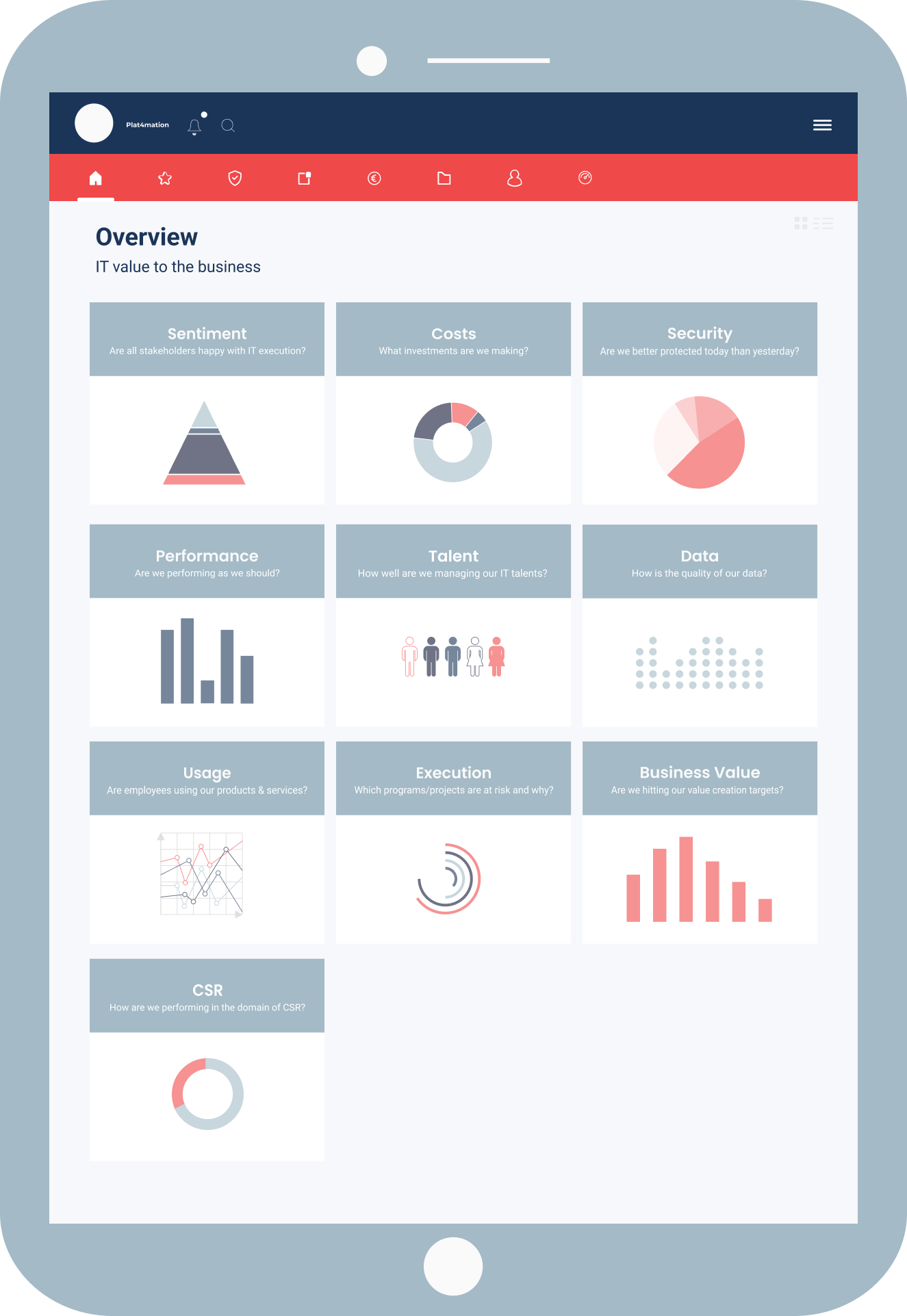
A 360˚ CIO dashboard gives a CIO a comprehensive view of the IT value chain. It provides CIOs the required insights to enable their departments to digitally transform the organization. By running IT like a business, you base your strategic decision-making on real-time data indicating business value, consumption and costs for both internal and external business partners.
In this post-COVID era, organizations feel an immense pressure to digitally transform their business models in order to retain and improve their competitive position. The digital landscape is growing more complex due to scattered tooling. On top of this, the growing complexity of IT landscapes is managed by an increasing amount of internal and external service providers. So, bottom line is that, in order to stay competitive in the current digital era, IT cannot be run as an expense center anymore*. In fact, IT should move to becoming a business driver.
For that, a 360˚ CIO dashboard is a must-have for you to take control over your IT value chain.
There are three things CIOs need to do CIOs to successfully run their IT like a business. We call these the 3 Success Factors.
A comprehensive overview in the form of a dashboard is essential when it comes to staying in control over your IT value chain. A lack of control limits the delivered business value, weakening the position of the CIO and the IT organization as a whole.
In a nutshell, CIOs need to start speaking the language of the business and clarify how they contribute to the business with the provided digital capabilities. Showcasing the right insights and reports in a dashboard can provide executives the information required to manage their IT value chain successfully in the current volatile digital era.
Unfortunately, the increased autonomy of teams and shifts in internal delivery responsibilities has led to the decentralization of data. With little to no centralized structures for CIOs to retrieve real-time data that enables them to steer on the digital delivery. On top of that, operational data is kept in siloes, making it hard to get an end-to-end view on service performance.
Most existing dashboards visualize a set of important metrics, keeping both IT team members and executives informed about the delivered IT performance.
But, these dashboards do not offer a full 360˚ view of an IT department that acts as a Business Driver.
We recognize three main issues with existing dashboards:
It is very much a challenge of selecting the right set of business-connected metrics to provide insight into the added business value of IT. And displaying them in such a way using the correct terminology that the business can understand.

Value vs. Vanity metrics
Instead of reporting based on performance (“This is how we have performed in the past quarter”), try to aim at showcasing value to the overall business. Measuring the cost but translating it to contributed value.
Leading vs. Lagging metrics
Instead of YTD reporting in hindsight (“Up to this day we have had X amount of security threats”) try to aim for metrics that are looking ahead in time. You will then showcase trend analysis rather than snap shots in your CIO dashboard.
Data driven decision-making
A 360˚ dashboard to support decision-making contains actionable metrics. The three Rs of actionable KPIs are: Reliable, Repeatable and Real time. Only then a dashboard can be used as an actionable and practical tool to support decision-making.
The most essential element of a 360 dashboard are its actionable insights, which allow CIOs to drive business with their IT factory.
In other words, you need to translate the right selection of single metrics and KPIs into value-adding use cases. This exercise will make you think twice about the purpose of a certain metric, which in turn will stimulate value-based decision-making.
The point we’re trying to make is the following.

The IT Manager thinks he’s doing a great job because he’s overperforming on the availability (99%) of a particular IT service whilst the SLA prescribes 97%.

Meanwhile, field service employees are frustrated because this exact service is not working on mobile devices…

So, IT thinks they’re doing a good job based on a single metric, but in reality, they’re not. Their dashboards are not painting the full picture.
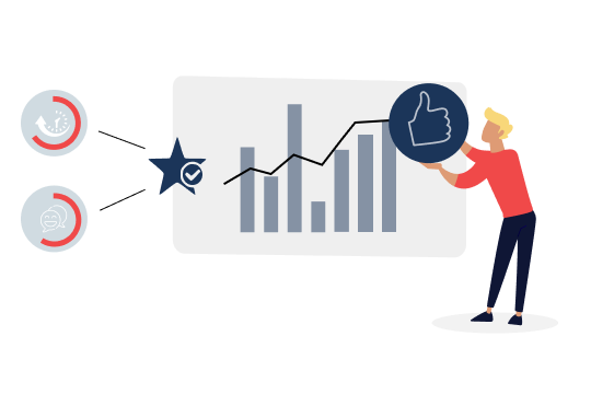
But how do you paint that full picture? Simple. By combining the Availability and Employee Experience metric in a 360˚ CIO dashboard, so you can see what value IT really brings! Doing so will help you spot areas for improvement in stead of looking backward all the time.
Based on our experience guiding major global companies in drafting their IT transformation strategy, we can advise you how to structure a 360˚ CIO dashboard tailored to your business. Or, we can even build it for you.
_________________________________
* Source: Technology Business Management: The Four Value Conversations CIOs Must Have with Their Businesses, Todd Tucker (2016)

Tijl Hoornstra
Digital Strategy & Strategic Advisory Services Lead
+31 633 009 348

Sign up to our monthly Flow@Work Exclusive newsletter to get free access to our expertise and lots of tips and tricks to make work flow on the Now® Platform.